Crowned, Not Conquered
A Self-Coronation
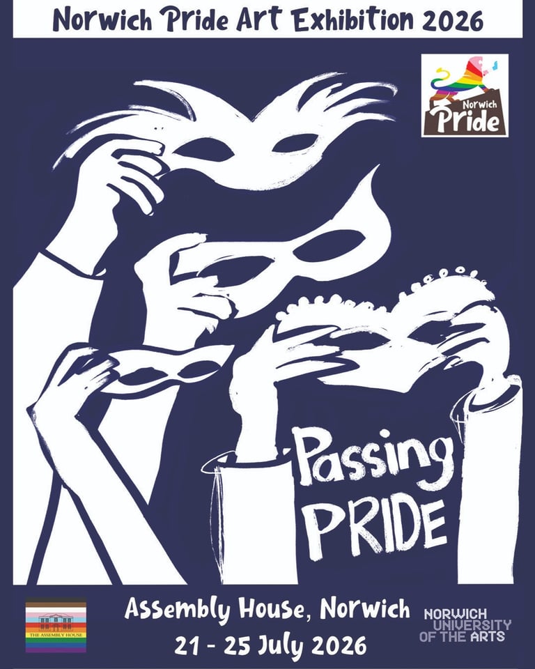
Presented at Passing PRIDE
An Exhibition by Norwich Pride as a part of their 2026 events programme
Curated by Rachel Collier-Wilson


The Brief
Passing Pride is an exhibition at The Assembly House, Norwich, running 21–25 July 2026, celebrating queer art as protest and as pride. The brief asked artists to respond to questions of visibility, conformity, and survival across queer identities who passes, who is protected, who is policed. It examined masculinity as armour, femininity as risk, and visibility as negotiation. It asked what we conceal to stay safe and what we reveal to feel validated. Putting on a mask can be an act of protest. Taking it off can be an act of truth.
Finding the Concept
I knew from the start that I wanted to produce something new for this exhibition. I didn't arrive at this image quickly. The brief sat with me for a while and I worked through several concepts before landing on the one you see here.
The first direction I explored was a series of five images me sitting in a gradually dwindling pile of party invitations, charting the social disappearance that comes with chronic illness. One image per year, the pile getting smaller, the space around me getting larger. It was about the specific loneliness of CFS/ME in queer spaces, the way declining invitations eventually means the invitations stop coming, the way you perform wellness to remain acceptable in a harbour which is meant to be safe and accepting. That concept was strong, but it was mournful. And production was heavy.
The second direction was simpler; me behind pink tulle, naked, wearing a crown, holding a masculine pose. The veil as a membrane between visibility and concealment, the crown as self-sovereignty. That felt closer. Then it expanded into a full series across every stripe of the Progress Pride flag, eleven images, one per colour. That was too much. I pulled it back to one image. The concept kept evolving.
Then, the final image concept arrived: a self-coronation as protest. Monarchy as the establishment. A ‘fuck-you’ delivered with queer power!
The Symbolism
Every element in the frame is deliberate:
The pink triangle:
Originally a badge sewn onto gay men in Nazi concentration camps, a symbol of persecution and attempted erasure. Reclaimed decades later by ACT UP during the AIDS crisis, flipped upward, paired with Silence = Death. Here it becomes a backdrop to sovereignty, I am sitting in front of everything that tried to erase people like me, like us, and we are still here.
The office chair:
My actual work-from-home chair. The throne of chronic illness. The seat I'm confined to work from, the place where much of my life now happens since CFS/ME reduced my world. Reframed here as a literal throne. The mundane felt regal.
The faux fur coat: Regalia:
Abundance. Unapologetic excess worn by someone who has been told in many ways to take up less space. Also feels great to wear, but not in a hot studio, in the middle of a heatwave! The dewy skin was sweat, not makeup!
The white harness:
A visibility statement. Social media censorship puts pressure on people to sanitise their content, to make queerness feel palatable to mainstream audiences. The harness refuses that. Kink as part of everyday life, where it belongs, in the frame. The white harness can also symbolise innocence or purity in the kink scene, possibly meaning a person is a novice, or new to the scene.
The camera as orb:
I'm a photographer. This is my practice, my eye, my power, my means of existing in the world creatively. Held as the sovereign's orb it becomes both self-referential and absurd in the best way. The camera I used in the image is a vintage twin lens reflex, which adds another layer; analogue, tactile, deliberate. I also took some selfies on it while shooting, which won’t some out as I was far too close, but it was fun, nonetheless.
The walking cane as sceptre:
Disability not hidden, not apologised for, not minimised. Carried as authority. The cane is part of my body at times and is an integral part of my life, placing it in the frame as a kind of sceptre refuses the idea that disability should be masked or concealed to be acceptable. My disabilities often go unseen; they are invisible to many. Masking my neurodiversity being the most exhausting.
The crown:
Cheap, crappy metal that kept bending out of shape, made of ‘who knows what’? Granted to self. Not given by institution, not inherited, not earned by conforming to anyone else's standard. This is the anti-monarchist's crown. The establishment has never protected queer people, disabled people, or those who refuse to pass. So, I took the iconography and redistributed it. No kings. Just hard earned personal sovereignty
The Pride colours balloons:
They weren't in the original concept. They were a choice on the day of the shoot. They add levity and colour; they place the image firmly in a tradition of queer celebration as well as protest. They also stop the image from taking itself too seriously, which I felt was important. I used rubber latex balloons, as another nod to our kinky siblings. They were popped and disposed of appropriately after the shoot.
The sports socks:
The gap between the grandiosity of the concept and the reality of a disabled queer man in his home studio who appreciates a good pair of socks is the whole point. The socks are honest.
The smoky eye:
Neither a mask, nor concealment. A knowing gesture toward performance, met with a gaze that is steely, nonchalant, and unguarded. Masked and unmasked simultaneously. The brief asked about the space between concealment and visibility; it lives in the smoky eye.
The disco ball:
Overhead, revolving, throwing light across the frame. It just so happened Cher was playing when the image was shot, which brought out the smirk of joy in the corner of my mouth, cementing this image as my choice as this for the final image to present for this exhibition.
Test Shots
I spent a very long time finding the right pose and expression, it was much fun!


The Process (Including the Disasters)
This image nearly didn't happen. Fighting burnout from the day job, brain fog, and creative block for weeks, it came together in the final moments before going on holiday.
The backdrop is hand-painted; a triangle drawn on a white backdrop paper offcut, cut and glued to the black backdrop. Mixing the correct pink proved more complicated than anticipated. The historical pink triangle is a specific tone: warm, medium, neither hot pink nor pastel, I felt like I wanted to get that correct to do its history justice. I spent time attempting to mix it from scratch, I got it wrong. I drove out, spent two hours stuck in traffic, bought more paint, tried to rescue the mix, and ended up wasting two large tubes of acrylic in the process. Five and a half hours lost on what should have been a thirty minute task, but many lessons learned in the process.
I ended up using pre-mixed magenta applied with a sponge brush. Which took five minutes. I will remember some corners need to be cut in future, to save energy if nothing else.
For the lighting setup I used three Elinchrom BRX500 strobes. A key light with a beauty dish for the sculpted, painterly quality the concept needed. A strip box with grid at forty five degrees above left for highlights and separation; the grid essential to stop the light spilling onto the black backdrop. The third strobe fitted with a snoot, pointed at the disco ball to throw rays across the backdrop and subject.
Capturing the disco ball reflections in camera required atmosphere, you cannot see light beams without particles in the air to scatter them. A fog machine was tried first and created an uneven distribution, ruining one side of the frame. The solution was atmosphere aerosol, sprayed and allowed to disperse for several seconds before triggering, giving a fine even haze that caught the rays without being visible as a cloud. But it still brought too much light into the image, so I abandoned trying to capture the rays in the shot, and settled for the reflections produced instead.
I had my camera tethered to my PC with 3 screens for live viewing, preview and editing on the spot, this allowed me to check poses before opening the shutter. I’m not a professional model, and can’t afford one either, meaning much of my work has become self-portraiture by default.
How I Think I Met the Brief
Passing Pride asked who passes, who is protected, who is policed. This image answers: I do not pass. I have never passed. I am queer, disabled, pansexual, kink-aligned, and I am sitting in front of the symbol of attempted erasure in a fur coat and sports socks with Cher on the stereo!
The brief named masculinity as armour. The tattoos, the harness, the direct gaze are armour; but armour worn with self-awareness whilst having a laugh. The balloons are meant to undercut the severity. The socks undercut the grandiosity. The armour is real and it is also a performance, and it is also a joke and all three exist simultaneously.
The brief said putting on a mask can be an act of protest, taking it off an act of truth. The smoky eye is the mask, it’s chosen, deliberate, minimal. The gaze behind it is authentic.
The pink triangle connects this image directly to the history the brief is invoking. Pride as protest, visibility as something that has been fought for, that we still need to stand for, proudly!
And the monarchy is used as reference to the establishment as a whole, the monarchy that gave royal assent to Section 28, that was silent through the AIDS crisis, that has never once led on queer rights; gets a queerly royal fuck-you! Delivered with a twist of humour. No kings.
Tech
Camera: Nikon Z8, 35mm F2 Prime.
Lighting: Three Elinchrom BRX500 strobes; beauty dish key light, gridded strip box highlight, snooted strobe for disco ball
Backdrop: Black backdrop paper, hand-painted pink triangle in magenta acrylic applied with sponge brush. Spray adhesive.
Props: Vintage twin lens reflex camera, my old walking cane, office chair, faux fur coat, white harness, gold crown, latex pride flag balloons, disco ball, crappy crown off a well-known auction site, sports sock, super short-shorts.
Postproduction: Lightroom Classic, Photoshop and a lot of swearing! I mean learning…
Get in touch
Let me know your thoughts, and if you'd like to purchase prints. 25% of all sales from this work go to fund Norwich Pride and help keep it free!